Stop telling people to look at your blisters

When I was a junior in high school, I took a history class that came with a mid-term research project.
In an attempt to impress the teacher, I decided to put together a massive presentation.
So after countless hours in the library, I took every artifact I collected during my research, and I put together a mega-presentation with 50+ slides.
I then submitted my magnum opus, and waited for the praise that was sure to come my way.
I ended up getting one of the lowest grades I'd ever received all semester.
"Hey, look at my blisters"
I haven't had to do a history report in a long time (thankfully), but I think about this story a lot.
Why? Because every now and then at work, I come across presentations that remind me of that history project.
It's not always because these presentations are excessively long (only sometimes).
Rather, it's because these presentations focus too much on showing how hard the author worked – instead of optimizing for insight and digestibility.
These types of presentations tend to do things like:
- Using 5 slides when 1 will do (to prove a lot of time was spent)
- Including tangential datapoints ("more #'s = more rigorous")
- Inserting complex visuals (to establish credibility & authority)
- Refusing to curate content (lest some efforts go unrecognized)
It's the equivalent of not only forcing the audience to look at how the sausage is made – but also forcing them to look at all your blisters from operating the sausage machine, so they know how hard you worked.
Why is this an issue? Well, because when you do this...
- Your message will struggle to land. Your audience is distracted by tangential information, instead of appreciating how much work you put in.
- Your message backfires. Your lack of curation means unintended signals are sabotaging your core message.
- You lose credibility. You come off as not knowing what you really want to focus on. Senior people will see right through it.
To extend the analogy further: your audience just wants to see a nicely plated and curated meal in front of them. So just serve the damn meal. Don't shove your blisters in their face – it doesn't make the meal taste any better.
But what does this mean in practice? Let's look at a few examples.
👋 Join 5000+ readers and subscribe to Herng's Newsletter for free:
Mistake #1: Too many slides.
I've previously written about the concept of "tightness" when it comes to exec-ready comms.
In the context of presentations, this means that you:
- Focus real estate on what is most critical to your message
- Construct an effective and efficient storyline "flow"
- Avoid having slides with duplicative content
- Cut down on unnecessary or tactical detail
But most people have not been trained to bias towards tightness. In fact, they're often trained to do the opposite.
Why? Because they think that the more slides they have, the more they'll be recognized for their efforts – and the more credibility they'll command.
This then becomes a real problem, because they end up:
- Wasting time with duplicative or irrelevant content
- Creating "rabbit hole" opportunities along the way
- Distracting the audience with excessive "flicking" back and forth
But here's the thing to remember: the most important presentations you build are almost always intended to solve some kind of problem.
As such, the structure of these presentations should be highly predictable, for example:
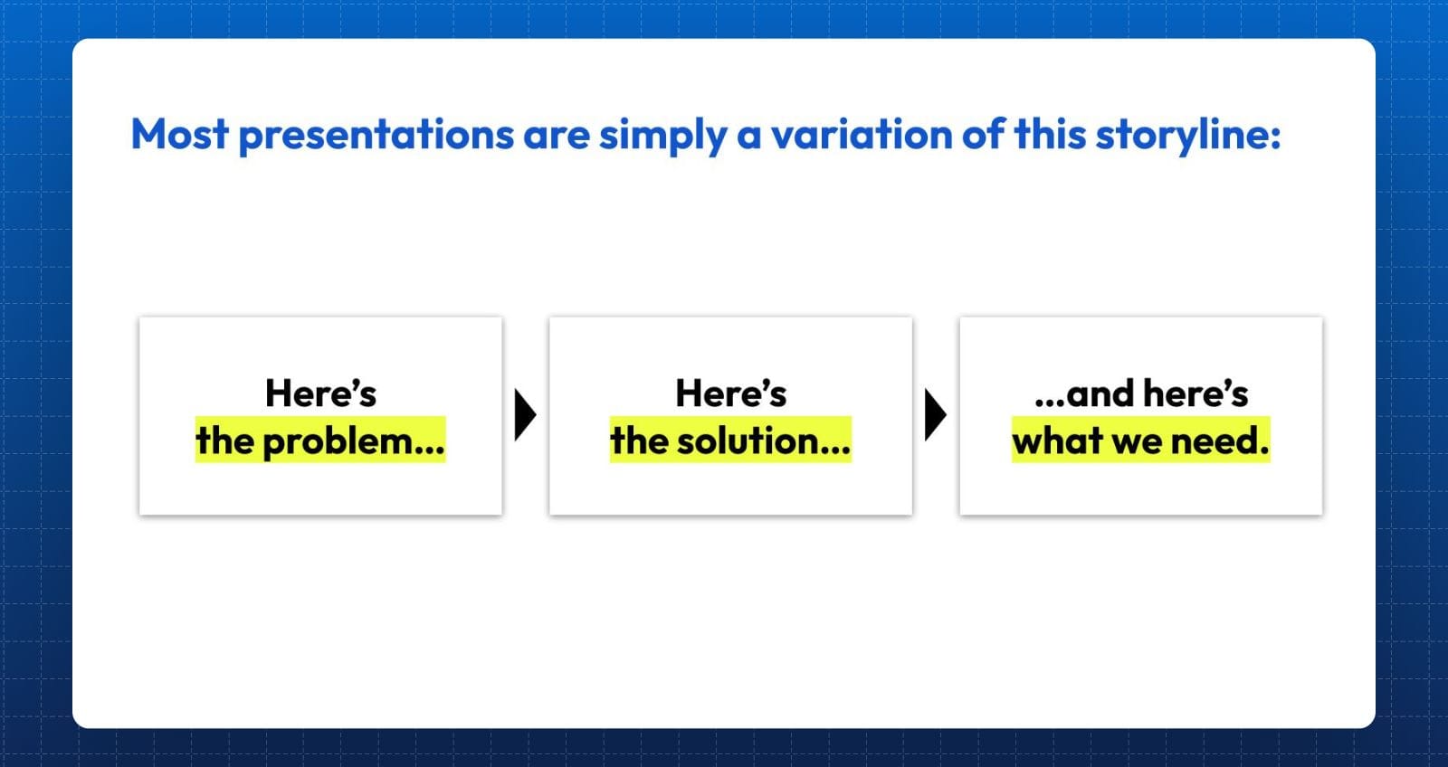
If you really think about it – every presentation essentially follows this structure.
Sure, some might have more slides – but that just makes them a more detailed version of this storyline.
For instance, this applies to:
- A business case ("Here's a problem... and I have a solution... but I need XYZ resources to make it happen...")
- An internal review ("Our business is not doing enough in XYZ area... and this is the action we should take... and here are the decisions we need...")
- An annual plan ("Here are the things we want to achieve next year... here are the things we'll do to get there... and here are the dependencies...")
As we can see – the script hardly ever changes. The storyline at its core is surprisingly simple. Anything on top of that is simply context and detail.
So if you're planning to take 20 slides into a 30-minute meeting? Think again. You might just be looking for an excuse to show people your blisters.
Mistake #2: Too many messages (and not enough focus).
Another common mistake? Trying to cram too many messages within an individual slide.
In fact, it's an even bigger problem if those messages are not even pointed at the same direction!
For instance, consider the following slide:
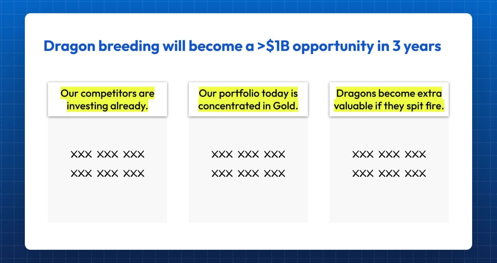
At first glance, this seems like a perfectly reasonable slide.
After all, it has a clear headline and a clean visual structure, supported by 3 pieces of seemingly relevant information.
But if we take a closer look, we'll realize that:
- Only the first bullet point ("Our competitors are investing already") is relevant, as it attempts to add credibility to the claim that dragon-breeding is a big opportunity.
- The second bullet point ("Our portfolio is concetrated in Gold") is tangential at best. So what if our portfolio is concentrated? Must we diversify? Is dragon-breeding the natural alternative? This is a potentially relevant artifact – but just not now.
- The third bullet point ("Dragons become extra valuable if they spit fire") is irrelevant to this slide. It does not help explain why dragon-breeding is a large opportunity. Including it simply confuses your audience.
And this is what we mean when we say a slide is unfocused: just because a message is insightful, does not mean it is always relevant. More is not always merrier.
And if you incorporate these types of messages indiscriminately? You don't gain more trust or authority. You simply distract and confuse.
So if it doesn't contribute to the main message – scrap it.
Mistake #3: Too much data (and too little curation).
For data-driven presentations: sometimes, the analysis is the easy part. Deciding what to show is much harder.
Why? Because if you're the one driving the analysis, you already "get" it. The data makes sense to you. You know where to look.
As a result, it can be really hard to "forget" what you know, look at your work through fresh eyes, and remember to curate properly.
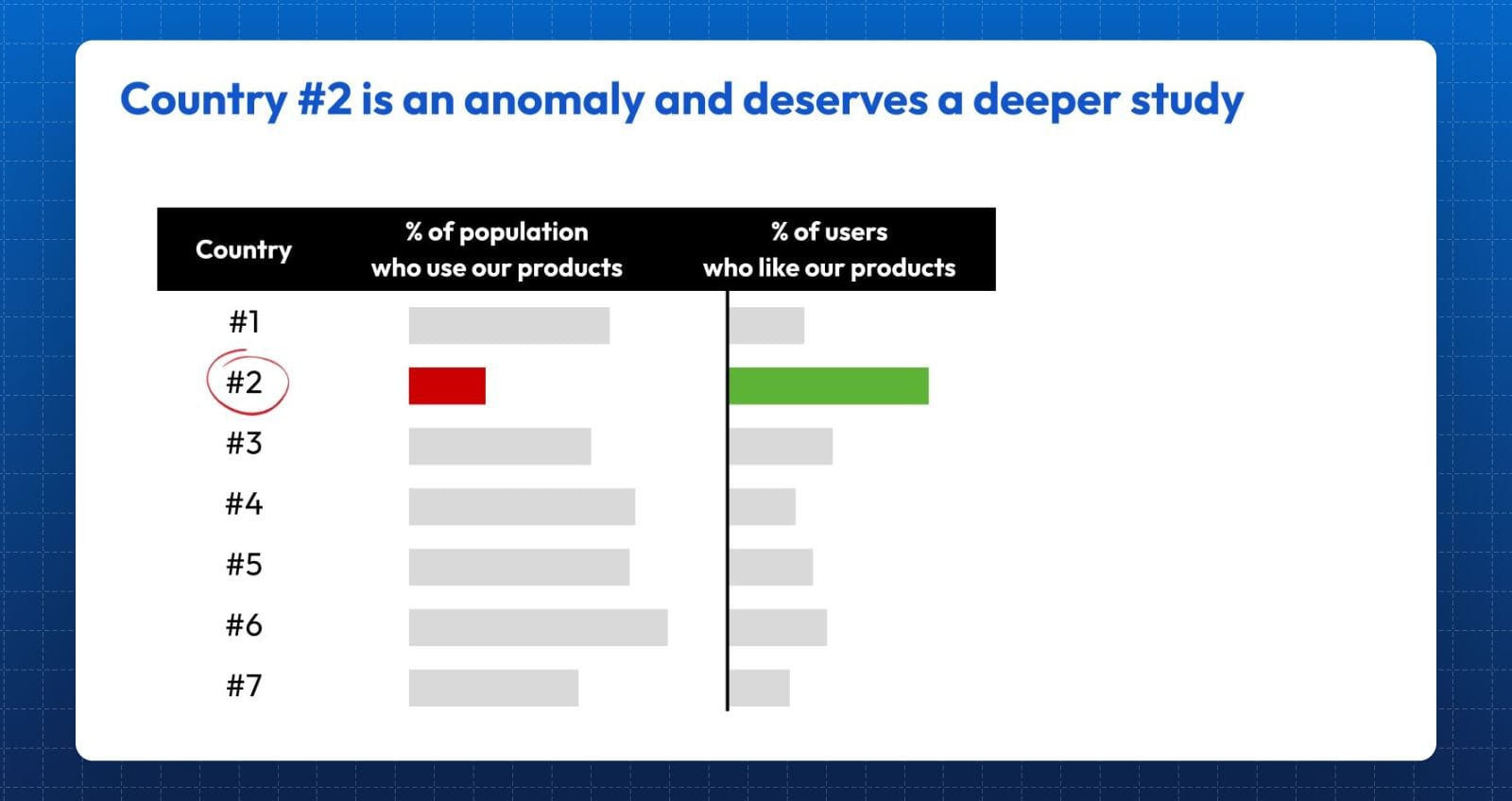
For instance, consider the following slide, which attempts to analyze how our products are doing across 7 markets:
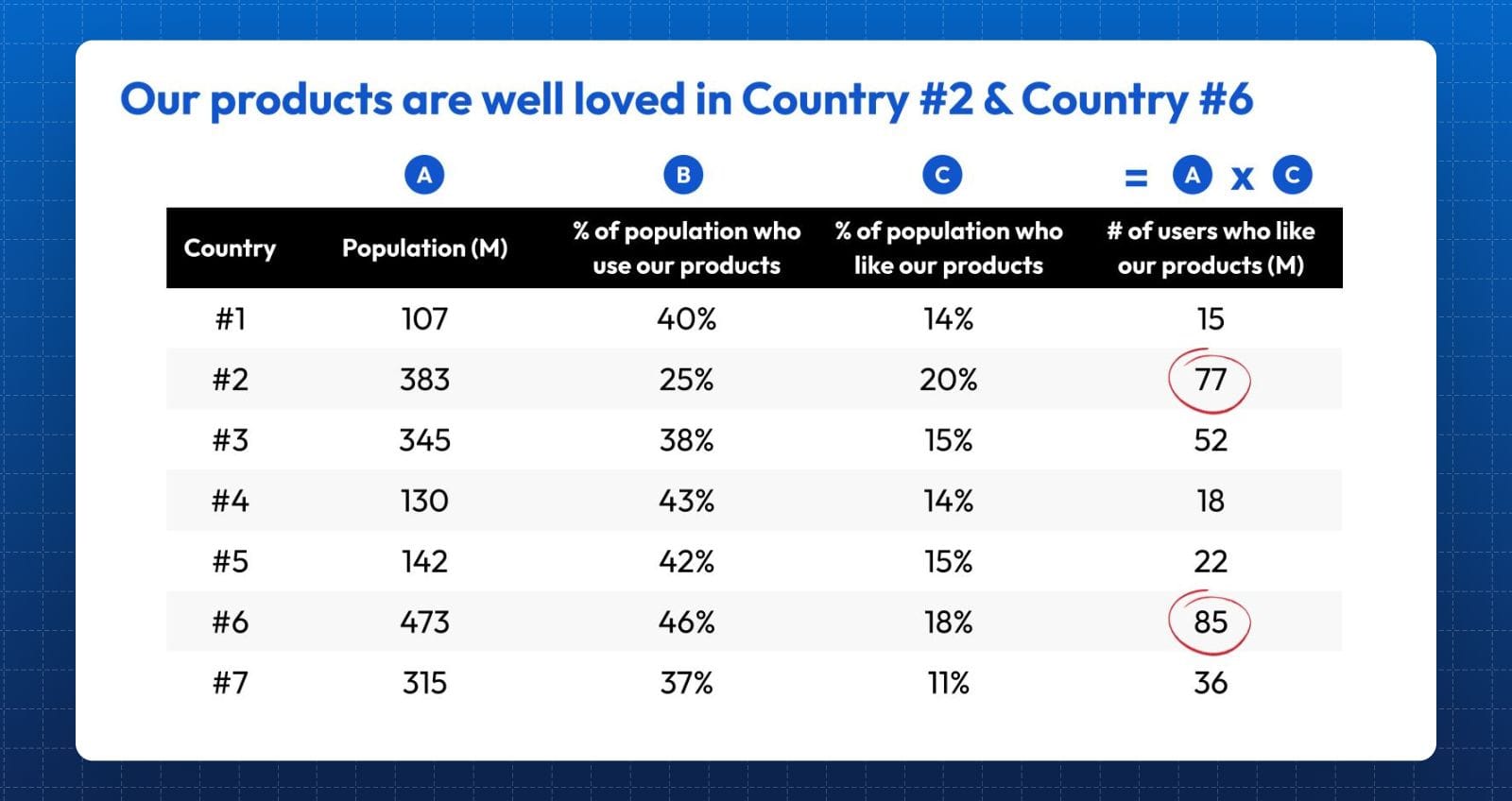
At a glance, this seems like a slide that would deserve a pat on the back. After all, the author has clearly shown that he put a lot of effort into pulling data and extracting insight.
But perhaps that's also the problem – because more isn't always better. In fact, it might even backfire.
For instance, in this case, the true insight doesn't actually occur in the last column. In fact, it's not even on the slide.
Because this data dump has actually come at the expense of showcasing another key metric ("Column D"), as per below:
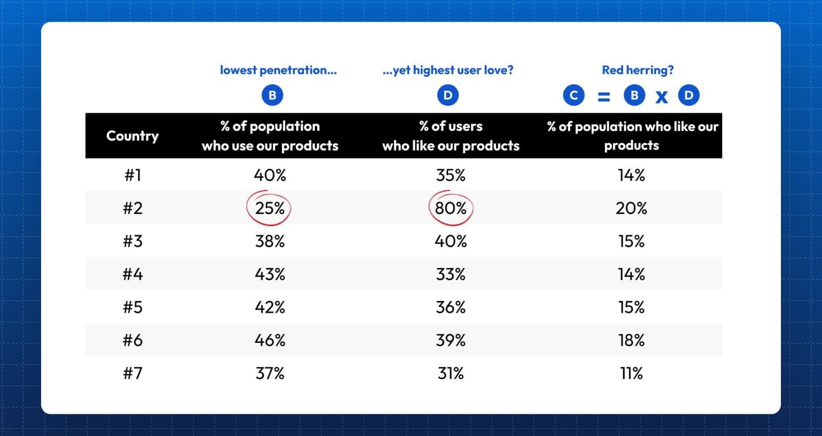
Why does Country #2 have the lowest user penetration, yet the highest ratio of user love? Whatever the answer is – this is a far more interesting and insightful question to ask.
And here's the point: it's not that the author didn't have this data. It's just that he was unintentional about finding pattern breakers, and showcasing what actually matters.
Instead – he took whatever he worked on, and dumped all of it in. He decided that this is the best way to show people that he worked hard (it isn't), and thus he knows what he's talking about (he doesn't).
But our story doesn't end here. The ability to extract insight is one thing – the ability to curate is another.
Because a sharper communicator would take things to the next level, i.e. by tuning out distractions and making things even easier for the audience:
Or, consider an alternative view that does the trick even better:
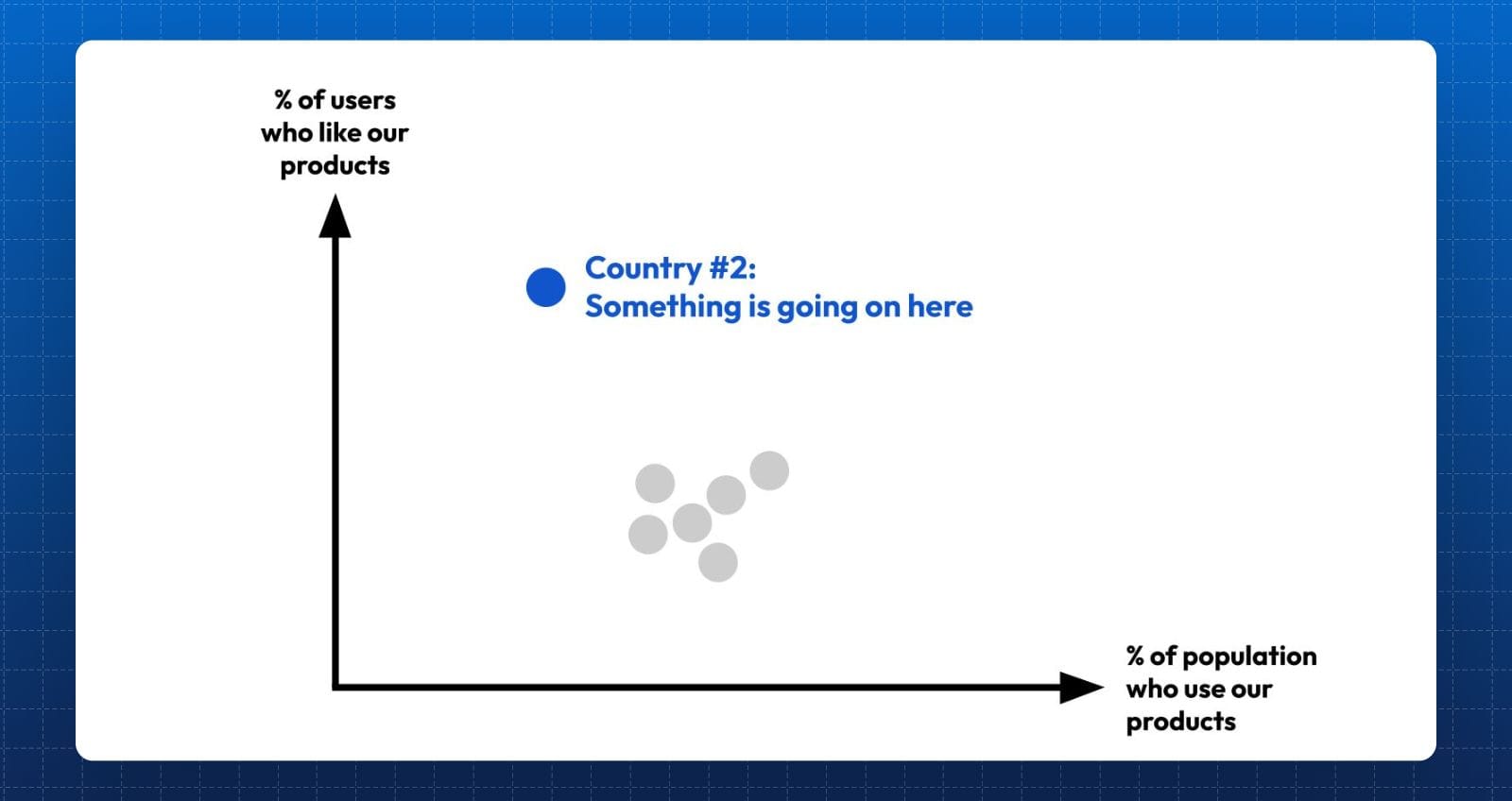
Again, there's no net new data here. There's no fancy calculus required either to arrive at esoteric insight. It's simply about curation and focus.
Because your goal isn't to dump everything on a page and strongarm your audience into buying into your authority and credibility.
It's about being extremely intentional with what you show (and don't show) – and remembering to put the spotlight on our audience, instead of your own efforts.


