Avoid self-sabotage from unintentional signaling
I write a lot at work. I also read a lot of other people's stuff.
And one key observation I've picked up over the years?
Even the best writers can unintentionally sabotage their own work because of one mistake.
That mistake?
Focusing too much on getting the message right – and focusing too little on also getting the signal right.
(And the difference is night and day.)
What's the difference?
What is a "signal," exactly?
Well, it's simply anything that isn't actually in your core message – but is often subtly implied.
And if you're not aware of the signals you're giving off when you communicate? You put your intended message at risk.
Because sometimes? How you say something becomes even more telling than what you actually said.
And the last thing you want is for your hard work to go to waste, simply because you focused too much on the message, and not enough on the signal.
Thankfully, to avoid self-sabotage from unintentional signaling? It's not rocket science.
You just need to know what you're looking for.
And in today's issue, we'll talk about 5 principles I suggest keeping in mind, in order to write effectively at work.
These 5 principles are:
- The order does matter.
- Real estate is a strategic choice.
- Beware of pattern breakers.
- Reactive is better (sometimes).
- You don't always want precision.
👋 Join 4900+ readers and subscribe to Herng's Newsletter for free:
Principle #1: The order does matter.
I get asked to review documents or presentations quite often at work.
And whenever I see a table or a list of things, the first thing I always ask is this:
"Is this in order of importance?"
You'd be surprised at how often the response is either "it isn't" or "hmm, I hadn't thought about it."
But here's the thing: the order always matters. People are naturally wired to assign greater importance to whatever comes first in an ordered list.
As a result?
If you don't put whatever is most important (or most urgent) up top, you risk confusing your audience.
Even if you had no intention of stack-ranking – people will do it for you in their heads.
And if the order you provide fails to jive with your core messaging? You've sent a bad signal. And your credibility takes a hit as well.
For instance, consider the following example:
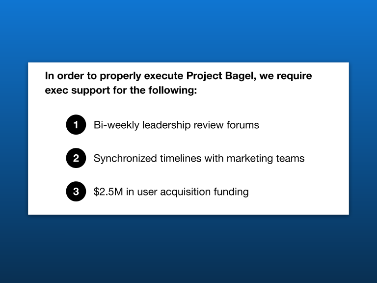
What's the problem? Well, it's obvious that item #3 is the most critical ask. And it is completely unacceptable why it isn't at the top of the list!
When this happens, you not only miss a chance to reinforce your core message – but you also come off as disorganized and untrustworthy.
After all, what you're saying is completely detached from how you're saying it.
In fact, if this fails to convince you – consider also the fact that you don't always get 100% of your audience's attention.
For example, sometimes you run out of time during meetings. And sometimes people simply skim through your materials.
Either way – the first item in a list invariably runs the lowest risk of getting overlooked, and tends to enjoy the highest recall and mindspace.
The order does matter.
(Related: when it comes to presentations, intentional ordering is just one of the many tips I have. Grab my 50-page slide science playbook for the rest.)
👋 Subscribe for free to get Herng's newsletter directly in your inbox.
Principle #2: Real estate is a strategic choice.
Let's start with a quick quiz.
Based on the following slide, and without any other context – what do we think was the most important strategy that helped us sign the deal with Partner X?
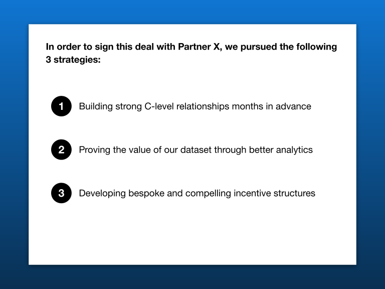
If you said #1 – you are more than justified (and thanks for not skipping Principle #1).
But let me ask that very same question again, except now you have the fleshed out version of the slide:
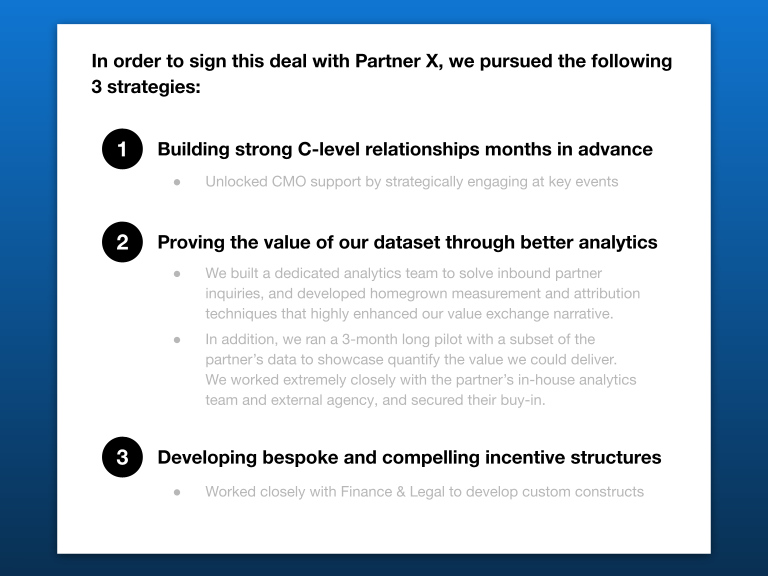
You probably changed your answer to #2. Why?
The reason is obvious: it received a disproportionate amount of real estate.
As a result, it's only natural to assume that #2 is the most important (or toughest) accomplishment.
But this is precisely the problem I see with many presentations and strategy documents: most people aren't intentional about the use of real estate.
Instead, they simply work on their building blocks in isolation, stitch them together, and call it a day.
They don't realize that most people are trained to assume that more space = more important. And vice versa.
So in the example above, if I were to stubbornly claim that #1 was the most important stategy (after all, I did put it at the top of the list)?
I've confused my audience (and hurt my own credibility).
And once you realize the importance of using real estate strategically in your written materials? You won't be able to "un-see" it.
For instance, consider a summary that goes like this:
👋 Subscribe for free to get Herng's newsletter directly in your inbox.
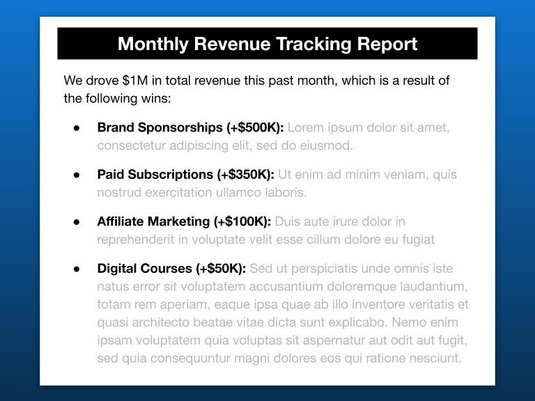
Your eyes should immediately pick up the fact that the smallest line item has somehow taken up the most space.
This then sends mixed signals to the reader and creates cognitive dissonance:
"Why is the smallest revenue contributor getting the biggest spotlight? Am I missing something here?"
Of course, let me be clear: there are plenty of scenarios in which that smallest line item could actually be most deserving of attention.
For instance, if it were a brand new revenue stream, then it actually might be the most interesting item to talk about this month – despite its limited size.
The problem, however, is this: you have to pick a side. Your message and your underlying signal should align.
You cannot anchor your message on one thing (i.e. suggesting that importance correlates with revenue size), yet let your signals suggest otherwise (i.e. wanting to focus the audience's attention on a nascent revenue stream).
Either the message has to change – or the signal has to be fixed.
Or you'll risk getting the worst of both worlds.
Principle #3: Beware of pattern breakers.
Let's think about principle #2 again. Why does something as simple as the imbalance of real estate trigger such reactions?
Because it's an example of something breaking the pattern. And when that happens? It's only human nature to figure out why.
Once you realize this, you'll notice that patterns (and pattern-breakers) appear more often that we realize.
(Note also that the ability to identify pattern breakers is a critical skill when it comes to data analysis. For more on that topic, read my take on how to extract insight from anything.)
For instance, consider the following:
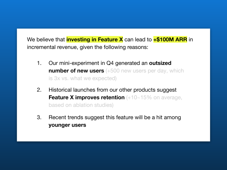
Let's be clear: there's nothing violently wrong with how this is laid out.
But you would be right in thinking that something feels "off," for at least a couple reasons:
- The first two points are data-driven and specific; the third one is not
- There's no attempt to provide evidence for the third point either
Again – does this mean that the third argument doesn't hold any weight? Not necessarily. But you do send a rather confusing signal. Because people simply can't help but notice the pattern breaker.
Therefore, paradoxically, while you want people to focus on where your content is most polished and robust?
They might just end up doing the opposite.
Of course, does this mean that everything you write needs to be absolutely symmetric and balanced? Not at all.
But you need to be at least highly aware of what you're doing.
👋 Subscribe for free to get Herng's newsletter directly in your inbox.
Principle #4: Reactive is better (sometimes).
The same message can convey very different signals – depending on if it is communicated proactively or reactively.
For instance, consider the following slide:
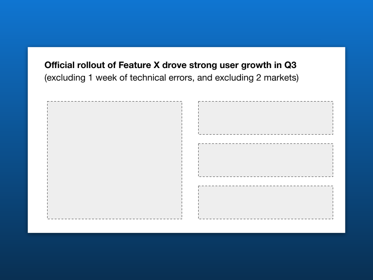
There's nothing wrong with being factual and truthful. But this headline is far from confidence-inspiring. It's simply dumping facts onto a page.
There's a better way to do this – without having to compromise your integrity.
For instance, consider an alternative construct where the caveat in this slide goes into a footnote, or is called out only within the corresponding chart.
That way, you avoid diluting your message – without worrying that you've accidentally misled your audience.
The facts are still there, but they're surfaced reactively by being embedded within a secondary section of your slide, instead of hijacking your key message.
And that can make a huge difference.
Principle #5: You don't always want precision.
Self-sabotage due to unintentional signaling doesn't just happen when it comes to text. There are plenty of mistakes you can make as well when it comes to numbers.
For instance, consider the difference between the two following statements:
- Statement A: We plan to deliver $50.6M next year in revenue.
- Statement B: We plan to deliver $50~52M next year in revenue.
Which one is better? Well, it really depends on what you're trying to achieve. Because:
- Statement A implies a high level of precision. The audience also immediately expects a high level of confidence in hitting that target.
- Statement B, on the other hand, suggests that there is still a fair amount of uncertainty. A lot is said without having to say anything.
Once you realize this, you'll start spotting many instances in which you can embed these subtle signals. For instance:
- Statement A: Feature X delivered $0.15M in revenue this year.
- Statement B: Feature X delivered $150K of revenue this year.
Factually, both statements are saying the exact same thing. And for someone who understands the business, it might not even matter.
However, for people without context?
Statement A paints a much more pessimistic picture than Statement B, simply by making a big bag of money ($150K) seem like no more than a rounding error ($0.15M).
Again, there's no inherent right or wrong. The only thing that matters is whether you're aware of what you're signaling – and if that's actually what you want.
(Related: for examples on how the same set of numbers can trigger radically different reactions, see the 5 tricks I use for effective storytelling.)
