Stop telling people to look at your blisters

It's been nearly two decades since I was in high school, but there's one story that I still remember to this day.
It was my junior year of high school. I took a history class, and it came with a mid-term research project.
It was an interesting topic, and I wanted to impress.
So after countless hours in the library, I put together a mega-deck. I gave generous real estate to every artifact I meticulously collected during my research – and I ended up with 50+ slides.
I then packed everything together and submitted my magnum opus, and waited for the praise that was sure to come my way.
I ended up getting one of the lowest grades I'd ever received all semester.
👋 Join 4900+ readers and subscribe to Herng's Newsletter for free:
"Hey, look at my blisters"
I haven't had to do a history report in a long time (thankfully), but I think about this story a lot.
Why? Because every now and then at work, I come across presentations that remind me of that research project.
No, it's not that these presentations contain 50 slides (OK, unfortunately once in a blue moon they do).
Rather, it's that they're crafted in a way that focuses on showing off the author's blood, sweat, and tears – instead of optimizing for insight and digestibility.
These types of presentations then do things like:
- Use 5 slides when 1 will do (to prove a lot of time was spent)
- Include irrelvant datapoints ("more numbers = more rigorous")
- Create complicated visuals (to establish credibility & authority)
- Refuse to curate (lest some efforts go unheralded)
It's the equivalent of not only forcing the audience to look at how the sausage is made – but also forcing them to look at all your blisters from operating the machine.
Why is this an issue? Well, for a few reasons:
- Your message fails to land – because your audience is distracted by tangential information
- Your message backfires – because your lack of curation means unintended signals are sabotaging your core message
- You lose credibility – because you're implying that you don't have a sharp view of what you're trying to say
So in today's issue, we'll look at some common examples of how this mistake manifests itself at work.
...But why do we do this?
Before we talk about examples, it's important to answer one question first: Why do we tend to show way too much in our work?
The first reason is that it's hard not to. Because it takes a lot of skill to...
- ...take something complex and distill it down to its essence
- ...scrap something when we know how much time we spent on it
- ...pretend we haven't seen our work and apply a fresh perspective
And thus, without learning how to critically examine our own work – we default to including as much as we can.
The second reason is that we're afraid. We're afraid that if we don't include enough "stuff" in our work – people won't recognize the efforts we've put in.
We think that even if the message doesn't land – the audience will at least cut us some slack, knowing that we worked really hard on this presentation.
Unfortunately, that is rarely true – except perhaps very early on in one's career.
So without further ado, let's look at 3 of the most common ways in which this defense mechanism manifests itself at work:
👋 Join 4900+ readers and subscribe to Herng's Newsletter for free:
Mistake #1: Too many slides (and not enough tightness)
I've previously written about the concept of "tightness" when it comes to exec-ready comms.
In the context of presentations, this means that you:
- Focus real estate on only what is most critical to your message
- Minimize any slides that are repetitive or duplicative
- Construct an effective and efficient storyline "flow"
- Cut down on unnecessary or tactical detail
But most people have not been trained to bias towards tightness. In fact, they're trained to do the opposite.
As a result, most presentations contain way too many slides, which is a problem because:
- They waste time with duplicative or irrelevant content
- They create "rabbit hole" opportunities along the way
- The audience gets distracted by the "flicking" back and forth
But the truth is this: the most important presentations you build are almost always intended to solve some kind of problem.
As such, the structure of these presentations should be highly predictable, for example:
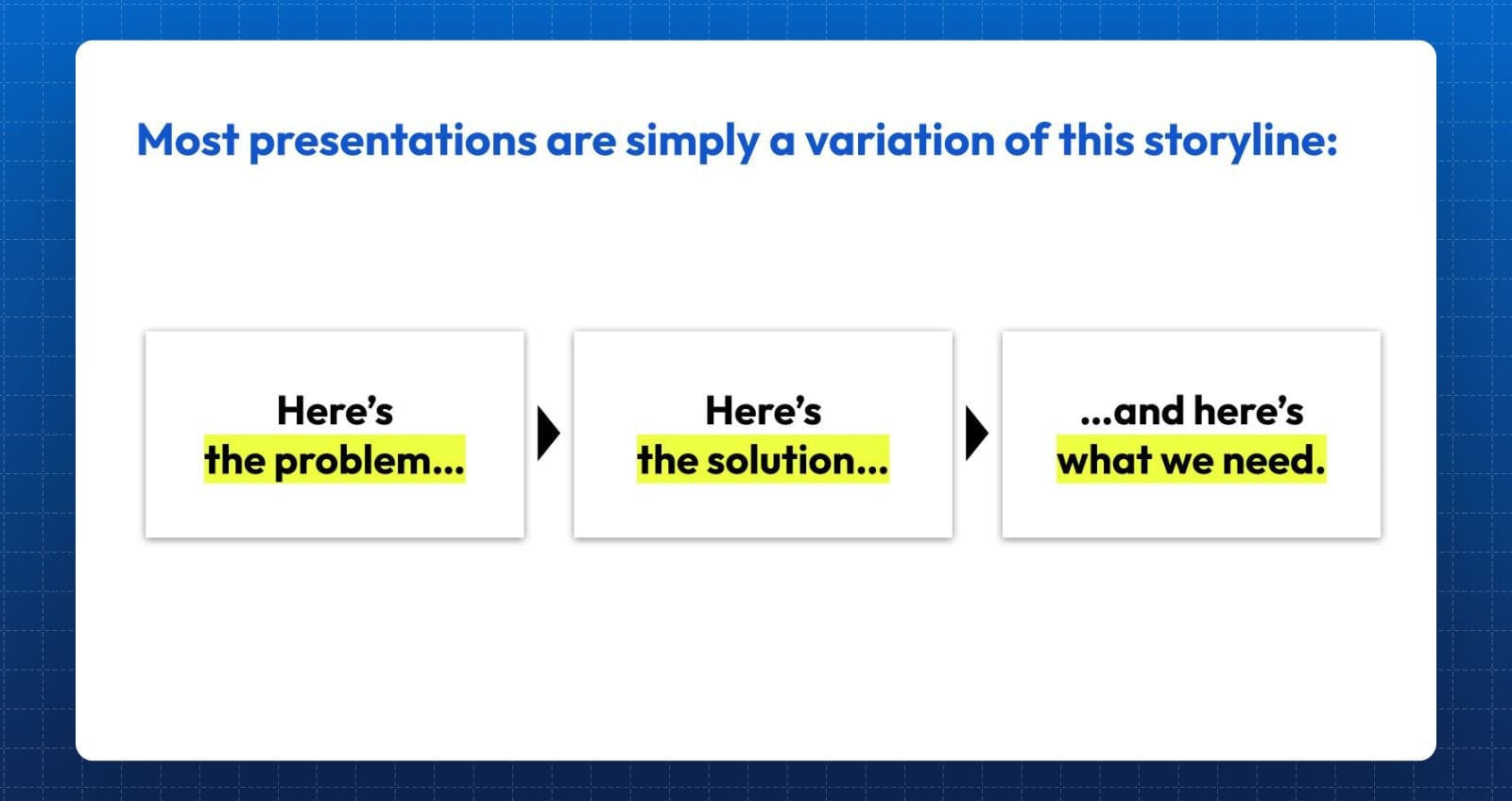
And if you really think about it – every presentation essentially follows this structure. Sure, some might have more slides – but that just makes them a more detailed version of this storyline.
For instance, this applies to:
- A business case ("Here's a problem... and I have a solution... but I need XYZ resources to make it happen...")
- An internal review ("Our business is not doing enough in XYZ area... and this is the action we should take... and here are the decisions we need...")
- An annual plan ("Here are the things we want to achieve next year... here are the things we'll do to get there... and here are the dependencies...")
As we can see – the script hardly ever changes. The storyline at its core is laughably simple.
In fact, if you're forced to: there's really no reason why you can't tell any story in 3 to 4 slides.
Because anything on top is simply additional context and detail.
Mistake #2: Too many messages (and not enough focus)
Another common mistake? Trying to cram too many messages within an individual slide.
In fact, it's an even bigger problem if those messages are not even pointed at the same direction!
For instance, consider the following slide:
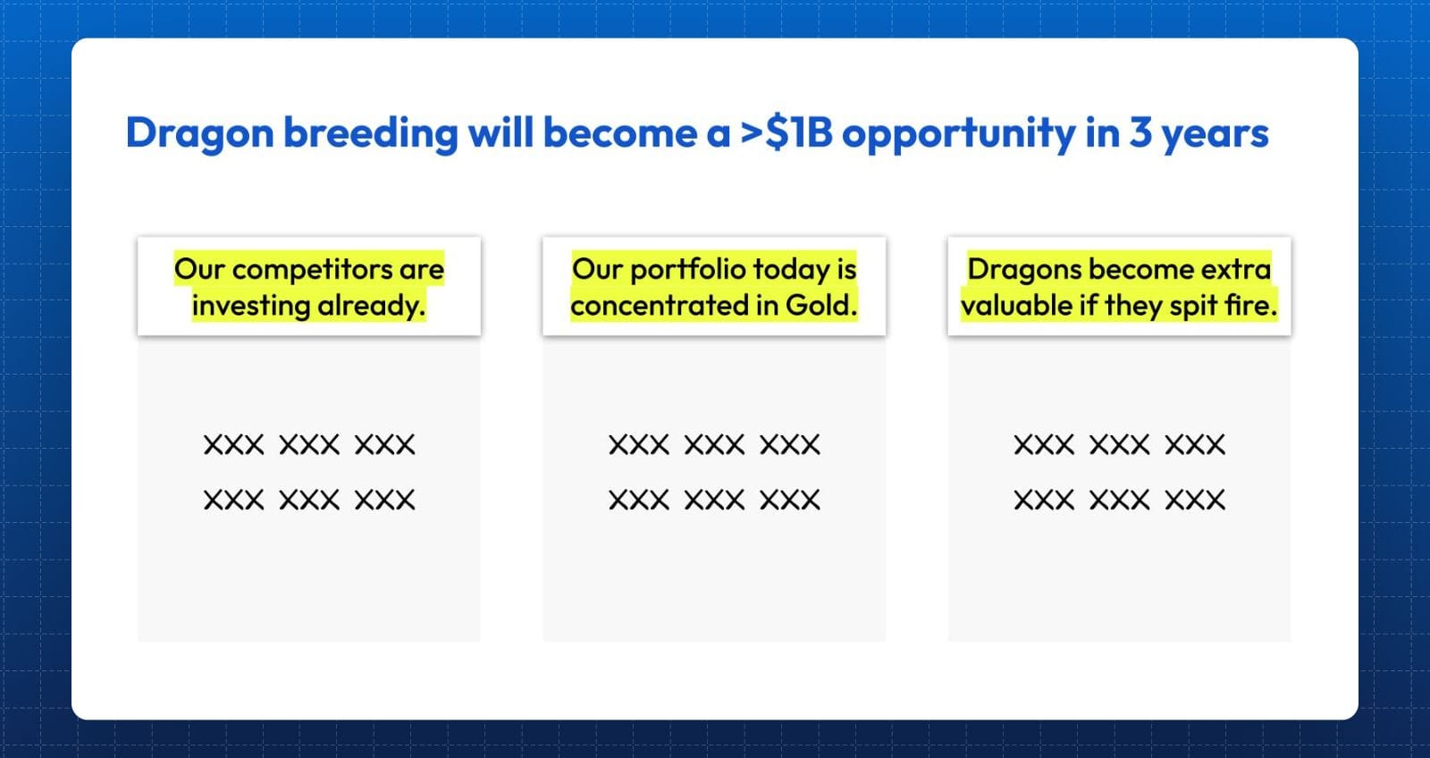
At first glance, this seems like a perfectly reasonable slide. After all, it has a clear headline, supported by 3 pieces of information that all seem relevant to dragon-breeding.
But if we take a closer look, we'll realize that:
- Only the first bullet point ("our competitors are investing already") is relevant, as it attempts to add credibility to the claim that dragon-breeding is a big opportunity.
- The second bullet point ("Our portfolio is concetrated in Gold"), however, is tangential at best. So what if our portfolio is concentrated? Does that mean we need to diversify? Is dragon-breeding the natural alternative? There is possibly a useful message hidden in here somewhere – but right now it's murky.
- The third bullet point ("Dragons become extra valuable if they spit fire") is irrelevant to this slide. It does not help explain why dragon-breeding is a large opportunity. Sure, it may be relevant at a later point when we explain the kind of dragons we need to breed – but for the purposes of this slide, it's a distracting message at best.
And this is what it means to have too many messages, and not enough focus. Just because a message is insightful, does not give you the license to include it by default.
If it doesn't contribute to the main message – scrap it.
Mistake #3: Too much data (and too little curation)
Focus is critical not only when it comes to what you choose to write – but also what datapoints you choose to show.
Because if you're the one behind the data analysis? You already "get" it. The data makes sense to you.
As a result, it can be really hard to "forget" what you know, and look at your work via the lens of a fresh audience to see if it still makes sense.
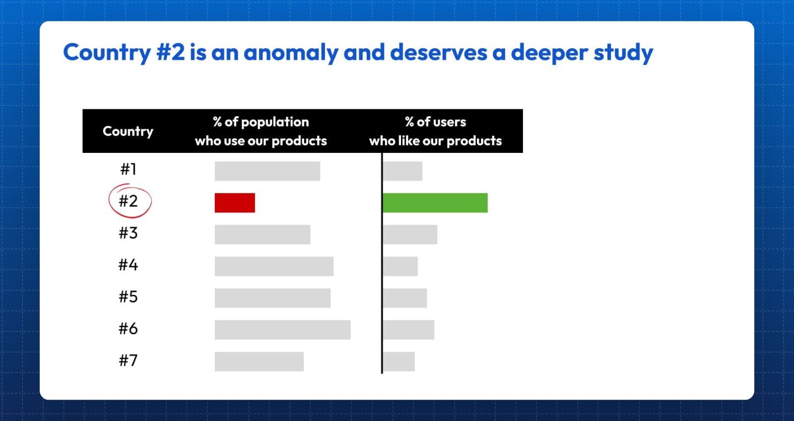
For instance, consider the following slide, which attempts to analyze how our products are doing across 7 countries:
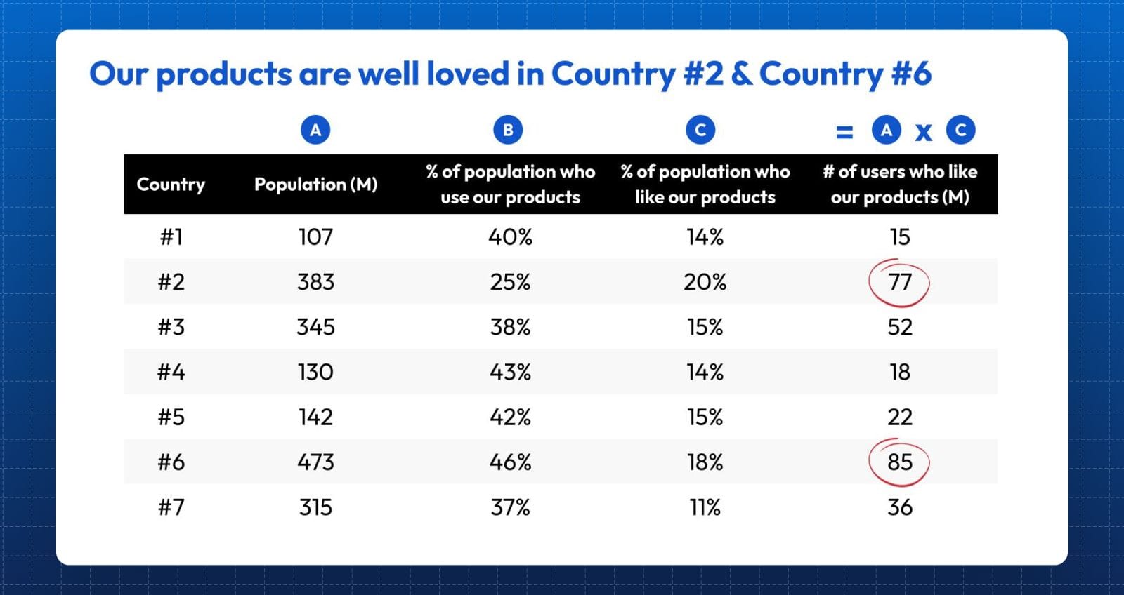
Again – at a glance, this seems like a slide that would deserve a pat on the back. After all, the author has clearly shown that he put a lot of effort into pulling data and extracting insight.
But perhaps that's also the problem – because more isn't always better. In fact, it might even backfire.
For instance, in this case, the true insight doesn't actually occur in the last column. In fact, it's not even on the slide. Because this data dump has come at the expense of another key metric ("Column D"):
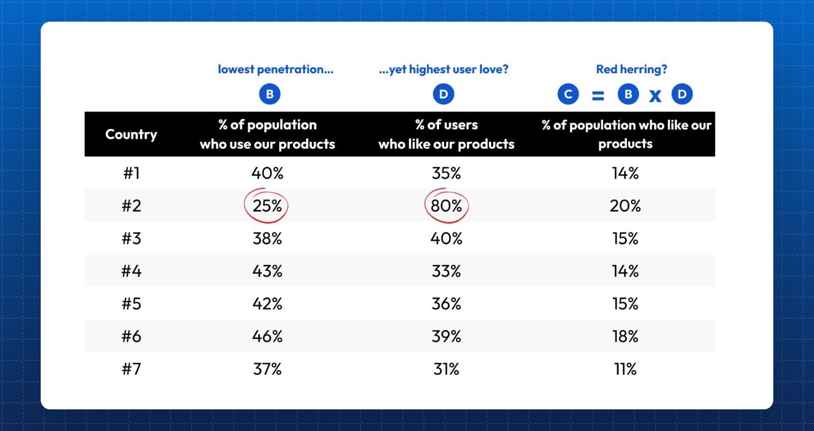
Why does Country #2 have the lowest user penetration, yet the highest ratio of user love? Whatever the answer is – it is a far more interesting and insightful question to ask.
And here's the point: it's not that the author didn't have this data. It's just that he was unintentional about finding pattern breakers, and showcasing what actually matters.
Instead – he took whatever he worked on, and dumped all of it in.
But our story doesn't end here. The ability to extract insight is one thing – the ability to curate is another.
Because a sharper and more intentional operator would take things to the next level, i.e. by tuning out distractions and making things super easy for the audience:
Or, consider an alternative view that does the trick even better:
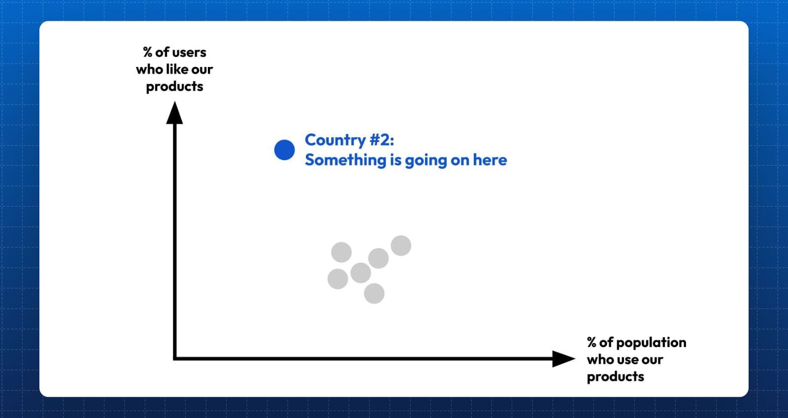
Again, there's no net new data here. There's no fancy calculation here to arrive at esoteric insight. It's simply about curation and focus.
Because your goal isn't to dump everything on a page so you can get brownie points from your audience.
It's about intentional curation, and doing whatever you can to make life as easy as possible for them.


