Your content isn't the issue. Your curation is.

🔊 Note: I'm building a masterclass to help more people become exec-ready communicators and scale their influence at work! To get early access: sign up for the waitlist here (no commitment needed).
Every once in a while, I find myself rewatching a favorite video of mine for comic relief.
It's a Hamlet skit performed by a star-studded British cast, where each performer takes turns reciting the Bard's most famous line:
"To be or not to be – that is the question."
But there's a twist to it. As each performer enters, he or she puts a different spin on the line – by simply emphasizing a different word:
- "To be OR not to be – that is the question."
- "To be or NOT to be – that is the question."
- "To be or not TO BE – that is the question."
- "To be or not to be – THAT is the question."
...and so on and so forth.
So what does this have to do with how we communicate at work?
Curation is the hardest part
When it comes to building presentations at work, most people have no problem identifying and including the right content. But that doesn't always guarantee that their message will land.
In fact, they might still find themselves in situations where:
- ❌ There is valid insight on their slides – but it fails to register with the audience, who is distracted by non-essential information
- ❌ Their slides don't work on their own – they only work if the presenter is actually in the room to provide voiceover and focus
- ❌ Their slides come off as overwhelming or even confusing – because the audience is left on its own to sift through everything
And when this happens? The issue is rarely because you don't have the right content.
Because just like in the Hamlet skit? You often have everything that you need already. It's not the content that's the issue; it's the curation.
In other words, you're just not shining the spotlight on the right things. And that alone can make all the difference.
So what does this look like in practice?
👋 Join 5000+ readers and subscribe to Herng's Newsletter for free:
"Shining the spotlight," in practice
Imagine that you're planning a user acquisition campaign for next year, and you're pitching your leadership to secure budgets.
Here's the mistake most people tend to make:
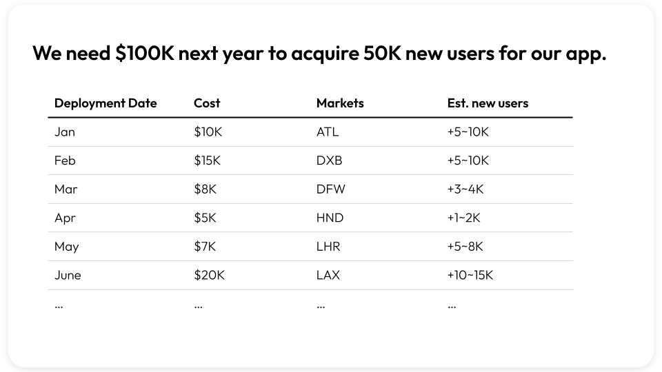
To be fair, this is a rather clean and nice-looking slide. So what's the issue here?
Well, for starters:
- ❌ There's at least 5 explicit and distinct pieces of info on this slide – but there's no curation. The audience is forced to read through everything before they can decide what matters the most.
- ❌ There's also implicit information that is important, yet underplayed: i.e. the acquisition efficiency (i.e. $ per user) and the variance across markets. Yet the audience is forced to extrapolate on its own.
- ❌ The meta-message here is also unclear: is the focus on operational details (hence the months), variation in acquisition efficiency (hence the markets), or something else? No one knows.
And when this happens to your slides? It's the equivalent of delivering that Hamlet soliloquy in the most monotonous tone possible – with no emphasis on any words.
You have all the right building blocks – yet nothing sticks.
So what's the "right" way to construct this slide instead? Well, it really depends on what story you're trying to tell.
For example...
Example #1: Cost efficiency
Let's say that you want to emphasize the cost efficiency of your plan, in order to maximize the chances of securing budgets.
Well, in that case, here's how you could "shine the spotlight:"
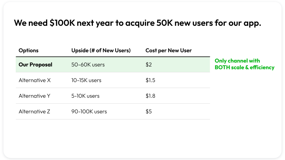
What did we do here? Well, a few things:
- Removed peripheral information (i.e. months and locations)
- Brought implied information to the forefront (i.e. cost per new user)
- Included benchmarks to put our numbers in context...
- ...yet still ensuring the spotlight is on our core message (scale & efficiency)
As a result, we're making life much easier for our audience (by telling them what to focus on) – and our story becomes more compelling as well.
In fact, while this is good, it's not great (yet). Because we can actually take things one step further.
For example, consider if we updated the header, and added some simple sign-posting to make things even easier to digest:
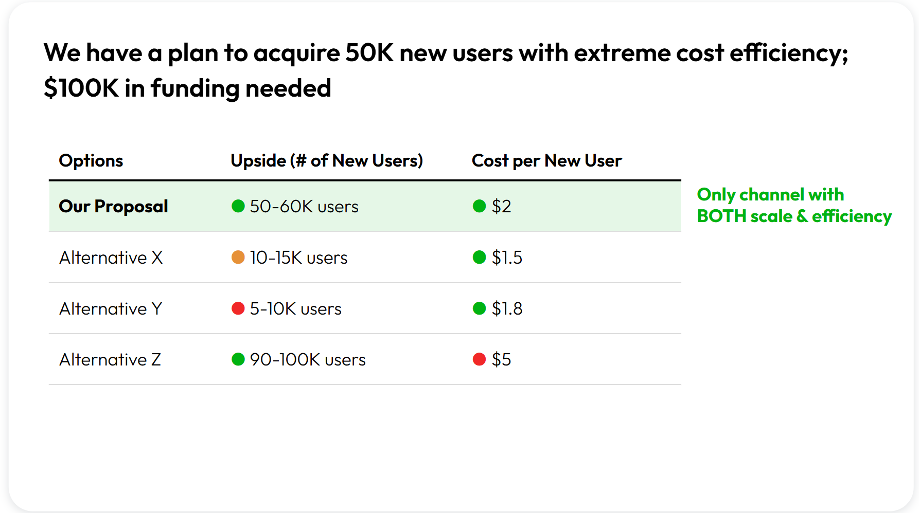
Again, we're not technically adding any new information.
We're simply making everything "point" in the same direction – so that everything plays a role in reiterating the same message.
Example #2: Cost efficiency (with nuance)
OK, but let's say our objective is a bit more nuanced.
Because yes, while we want to secure the entire $100K budget? We also don't want this to be an all-or-nothing situation.
In that case: could we tweak our slide to ensure that we can still secure funding for our top-priority markets, even if we don't get the entire $100K?
Well, that would require a slightly different way of shining the spotlight, such as below:
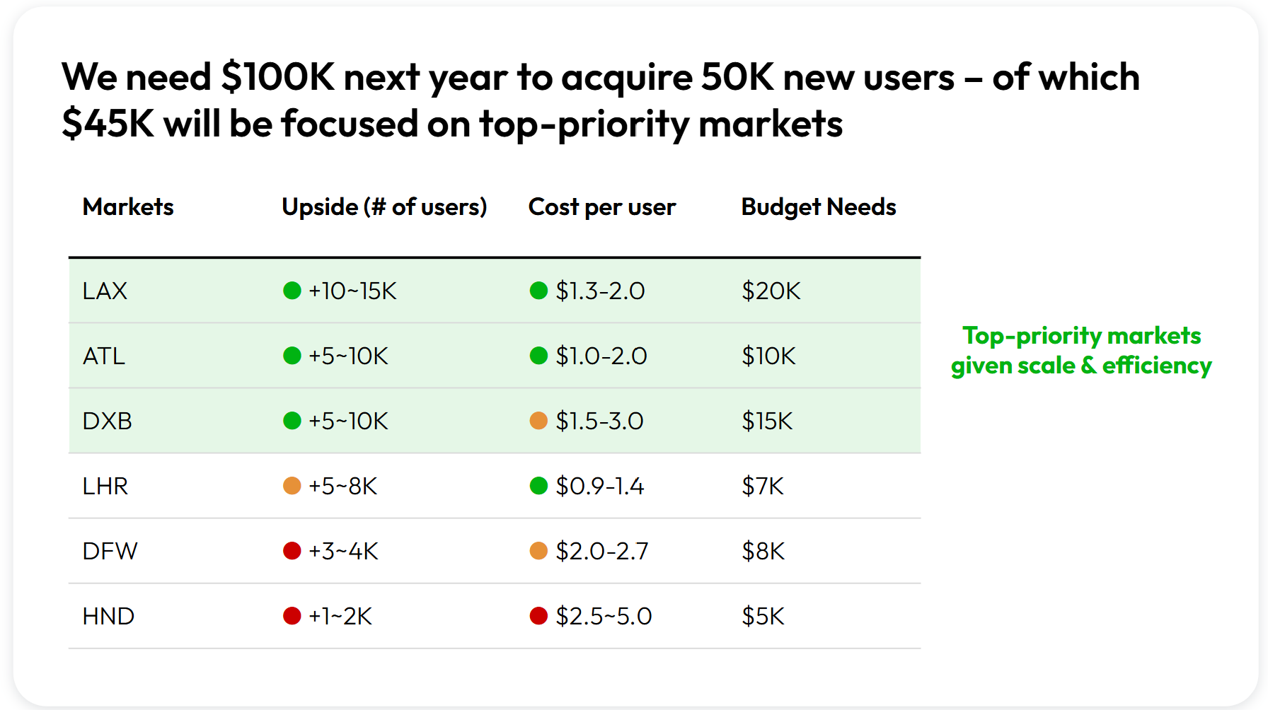
Specifically, in this case, what we've done is this:
- Anchored on markets (instead of months) – given our renewed objective
- Leveraged "traffic lights" to illustrate why certain markets are prioritized
- Sorted our table intentionally, to draw attention to the top priority markets
We did not introduce new building blocks – yet our message is still sharp, nuanced, and compelling.
Example #3: Tactical execution
OK, but what if we're not intending to "pitch" for resourcing, and instead we're focused on illustrating the operational implications?
Well, in that case, we can retain most of our building blocks, but simply shine the spotlight elsewhere. For example:
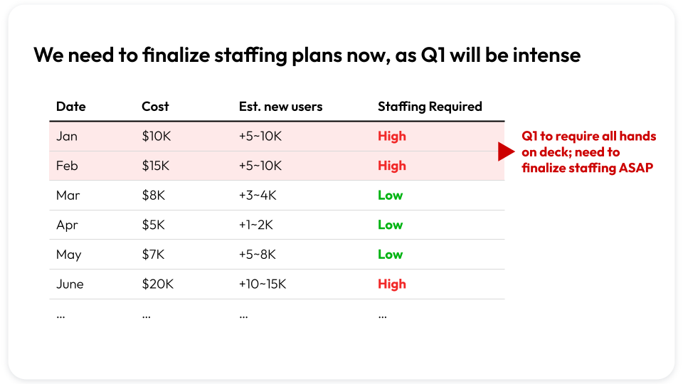
So what happened here, exactly?
Well, most obviously: we've chosen not to talk about our total budget needs or acquisition efficiency anymore.
(And that's OK – because it doesn't help us achieve our objective in this case!)
Instead, because we're now focused on operationalizing our plan, we've decided to:
- Retain the monthly schedule (to show when things are busiest)
- Add the implied staffing levels (given our focus on execution)
- Call out the urgency (which is where we've pointed our spotlight)
Again, remember: it's not that this version is better or worse than the last version.
It's just that in this case? It's the most well-curated version to help us achieve this particular objective.
👋 Join 5000+ readers and subscribe to Herng's Newsletter for free:
Quick Recap
🔊 Reminder: if you found this useful, you might also enjoy the masterclass I'm building! Learn how to influence execs and punch above your weight at work. To enjoy early access: sign up for the waitlist here (no commitment needed).
So, to recap what we covered today:
- When it comes to perfecting your slides? Think less less about content, and more about curation.
- In other words: if you're not "shining the spotlight" on something? Then you're not thinking about what you're trying to say.
- Remember: while there's no such thing as a perfect slide, there are perfectly curated slides. It all comes down to your objective.


