🔥 Why I Wanted to Burn My Slides from 2017

I recently looked at a strategy presentation that I had built back in 2017.
Boy was it scary! I wanted to burn the slides right away 🙃
But here's the funny thing:
I actually worked super hard on it. Invested countless hours. Revised it dozens of times.
But that's the thing sometimes.
You don't know what you don't know. You can't see what you're not trying to find.
Thankfully, I've learned a thing or two about building slides since then.
👇 And here's the actionable advice I wish I could tell myself from 2017:
#1 Make use of your slide headers.
I had terrible slide headers. In fact, they weren't headers at all.
Instead, I essentially used them as labels. Here's what I had as headlines:
- "Automobile Market: Key Trends"
- "Snapshot of Key Players"
- "Typical Marketing Budget Allocation"
These were no better than legends for a chart.
There was no attempt to provide insight to the reader.
It was wasted opportunity after wasted opportunity.
#2 Please don't use 8 different colors.
I had no artistic sense in 2017.
So perhaps to overcompensate, my slides tended to employ many colors (across conflicting color palettes to boot) to accentuate my messages.
The colors didn't work. They were distracting. And they definitely did not help contribute to sense of continuity across the slides.
It's 2023, and I still don't have much of an artistic sense. But I've learned to use simple and consistent color schemes throughout my presentation.
#3 There's no shame in using simple tables (sometimes).
You don't need to turn every datapoint into a bar chart, line graph, or bubble chart.
You don't need a complex visual on every slide for your presentation to be considered smart or insightful.
Sometimes all you need is a simple table to deliver your message. And you can still call attention to things easily with callout boxes or different colors.
Sometimes trying to do too much else is overcomplicating.
#4 What's the "so what" (and when will you get to it)?
Put differently: don't bury the lede. And bias towards action when you can.
I have talked about these principles extensively before – see below – but the gist of it is simple.
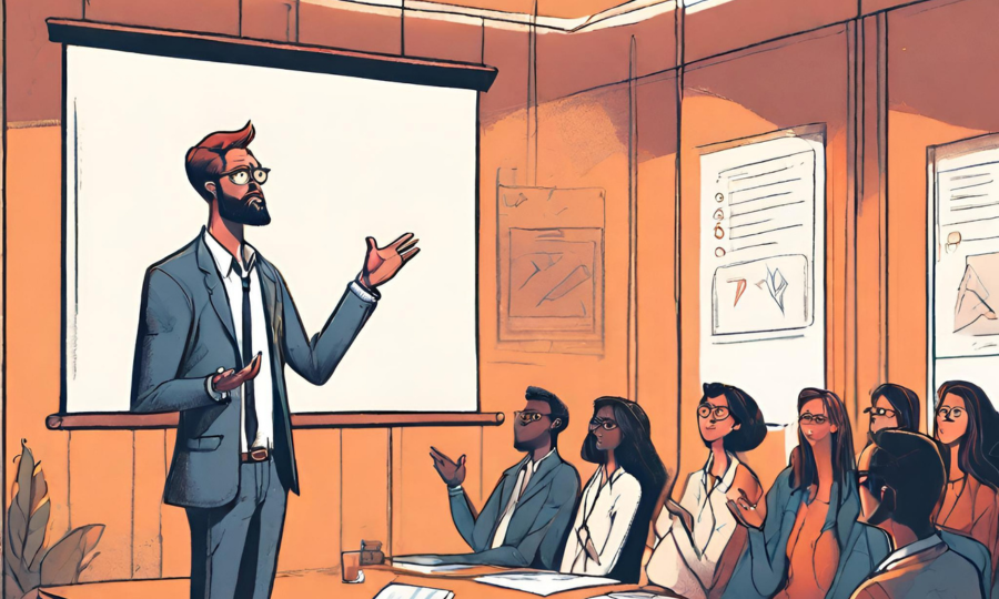
Most presentations tend to be built with very logical storylines — which is not a bad thing. After all, presentations are stories, and so the storytelling logic has to make sense.
The downside, however, is that you bury the lede.
Your audience is left dangling, wondering what the implications are for them. They're wondering when you'll tell them the "so what."
So instead: Lead with your conclusion / recommendation / ask.
And ask yourself if your lead-in slides are actually preventing you from getting to your money slide(s) as quickly as possible.
#5 Get rid of animations. Please.
Potentially controversial one – but I received this advice once and have never looked back since.
Here's why you should avoid including animations/transitions in your slides (unless you're delivering a one-way speech, like a TED talk).
When you’re in front of executives, you will rarely have the opportunity to control the flow exactly as you plan, as they will interject with comments and questions as they please.
And when they throw questions at you (and you happen to be in the middle of your cool animation flow that takes five clicks — or was it four?), you want to be able to tackle those questions directly, or jump quickly to the slide that addresses them.
The last thing you want is to appear rattled while you’re frantically clicking around your animation-littered slides to find the right landing spot.
👇 If you enjoyed this, I also talk extensively about how to build exec-ready slides in my free crash course below:


